We've just completed a website re-build for the lovely Spencer Swaffer. With Spencer's old website getting on a bit in years, we've just completed a re-build of it, using the existing design.
Read on to find out more the new features and what the upgrade has entailed!
Retina
Many computer screens, laptop screens, as well as mobile & tablet screens such as the iPad & iPhone are now "retina". This is also referred to as 4K, 5K etc.
This means that these screens can display pictures (like images of your stock), in a much higher and deeper resolution; making the picture feel much more real, and delivering enhanced clarity.
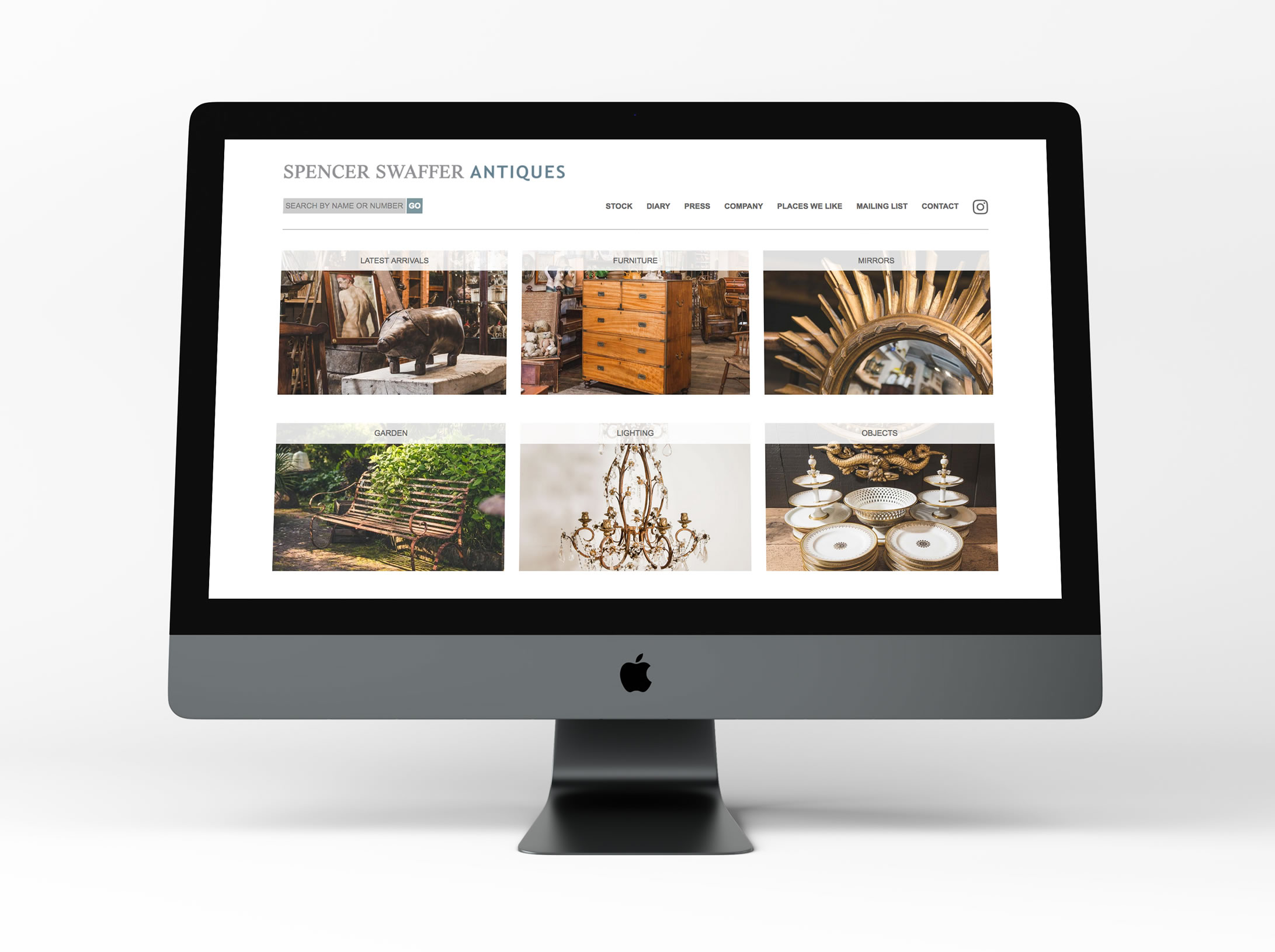
The new Spencer Swaffer website takes advantage of retina technology, and now displays newly uploaded images in retina format.
Better on bigger screens
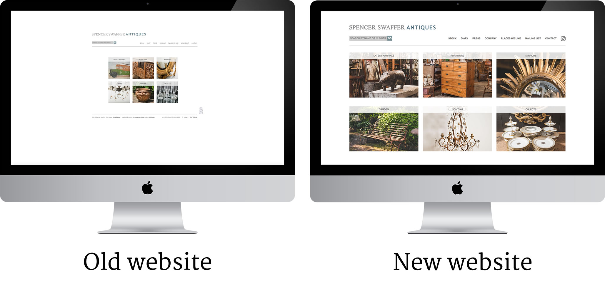
Spencer's old website would look quite small on a large screen.
Back when the old website was created, screens weren't as big, and not many people had big computer flat screens as they were expensive! So rather than the average computer having a 17" screen like it did back then, screens like a 27" iMac are really common these days so it's important the site looks good on a big screen.
The new website makes much better use of the space, and everything appears larger, whilst still feeling spacious.
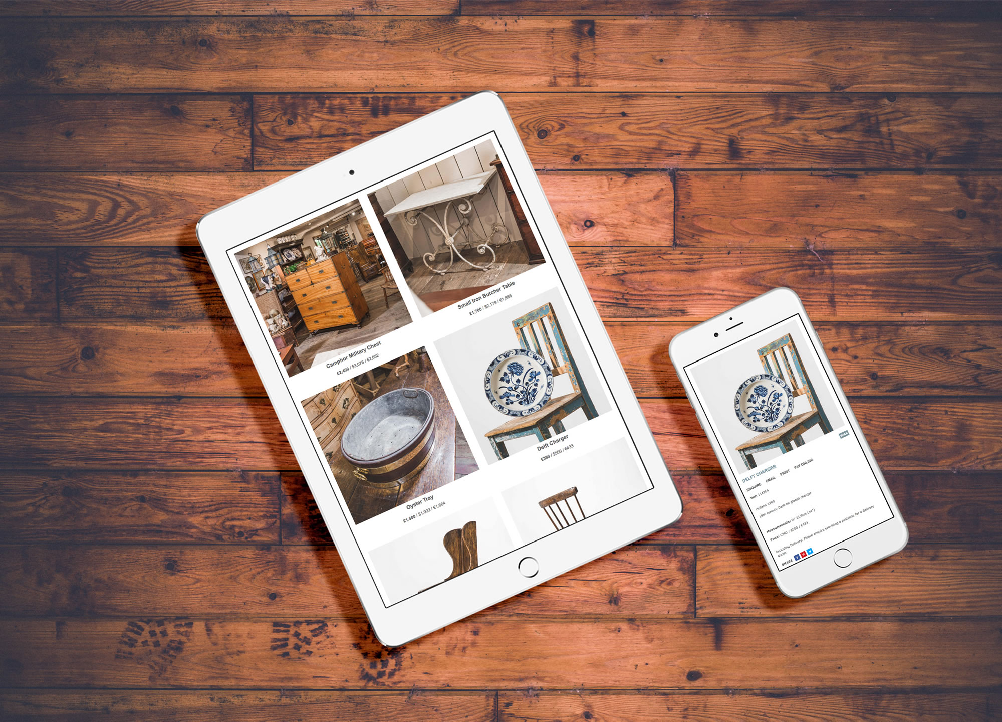
Mobile & tablet responsive
The previous website wasn't mobile & tablet responsive. This means to use the website you would have use two fingers, and "pinch & zoom" in and out and swish around the page to view everything, or navigate around, as is the case with all non mobile responsive websites. This was rather laborious, and websites which aren't mobile & tablet responsive can cost you visitors through people's impatience. Worse still, if your website isn't mobile & tablet responsive, it can appear lower in Google's rankings!
That isn't the case with Spencer's website anymore however!
His new website:-
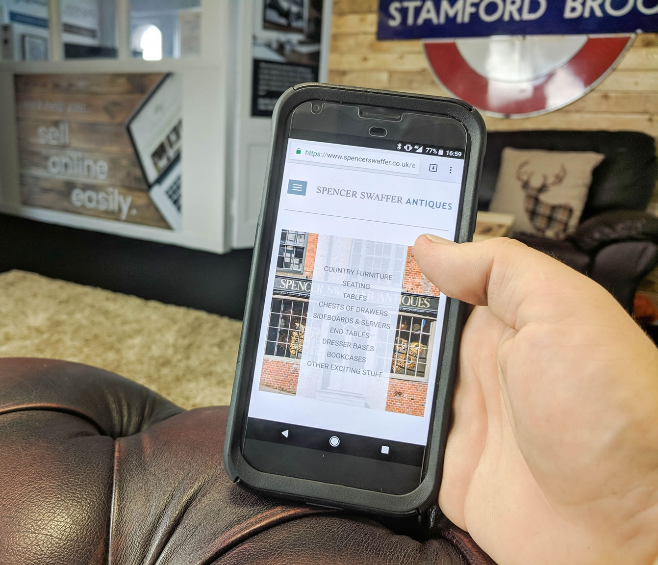
- One handed operation
As you'll see from the photo above (which is of my hand!), the website can now be easily operated with just one hand.
- "Hamburger" menu
The main menu / navigation, is also easily accessible using the "hamburger" menu on the top left of the screen.
- Easier to get around
As the website shrinks down to whichever size screen you're using, it's much easier to browse and navigate around.
- Retina
Pictures will be retina on a phone too! The picture above is me using the Google Pixel XL which is a retina screen phone, and shows much higher image quality. You'll also find that iPhones and iPads created in the past few years are retina; so it's worth making sure your website is retina to take advantage of the better screen quality.
Better for search engines
It will take Google a few weeks to update, so as of now it's early days, but we've performed a major overhaul of the way Spencer's website is structured and search engine optimised, meaning over the coming weeks it will start to rank much better in Google.
What the client has to say
"ph9 made it a very easy experience for us"
See for yourself
You can see Spencer's new website here:-


